
User research to identify issues with Queens College Libraries website and features that should be implemented on the website.
Overview
Queens College Libraries is used by thousands of students, professors, and alumni. The website allows people to access various resources and databases. With so much information being provided to students, professors, and anyone who uses Queens College Libraries, we wanted to provide a better experience to those who use the website.
Problem
Queens College Libraries provides a vast amount of information to users. From research to collections at Queens College. However, with so much material on one website, users often encounter issues while using the website.
We sent a survey out for users to identify issues they came across while using the Queens College Libraries website. We obtained 29 responses to our survey.
Research
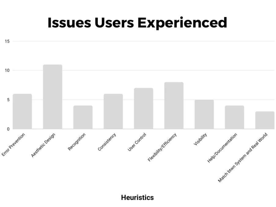
I conducted a heuristic evaluation to find usability issues users were facing while using the Queens College Libraries website.
*Some responses selected more than one associated heuristic.
Pain Points
The 3 main takeaways of the user pain points were:
Links are broken, making it difficult for users to find the information they need
Certain buttons and icons overlap or are not entirely visible to users
Inconsistency throughout the website making the user feel confused

“…while I was looking for a topic it shows that the article regarding that topic is available online. But when I clicked the online availability it opens more links which made me confused and lost.”
“When you visit the databases tab it is not very clear how that tab differs from the one search tab…There might even be people who have never visited the QC library website and they might not know what finding databases is.”
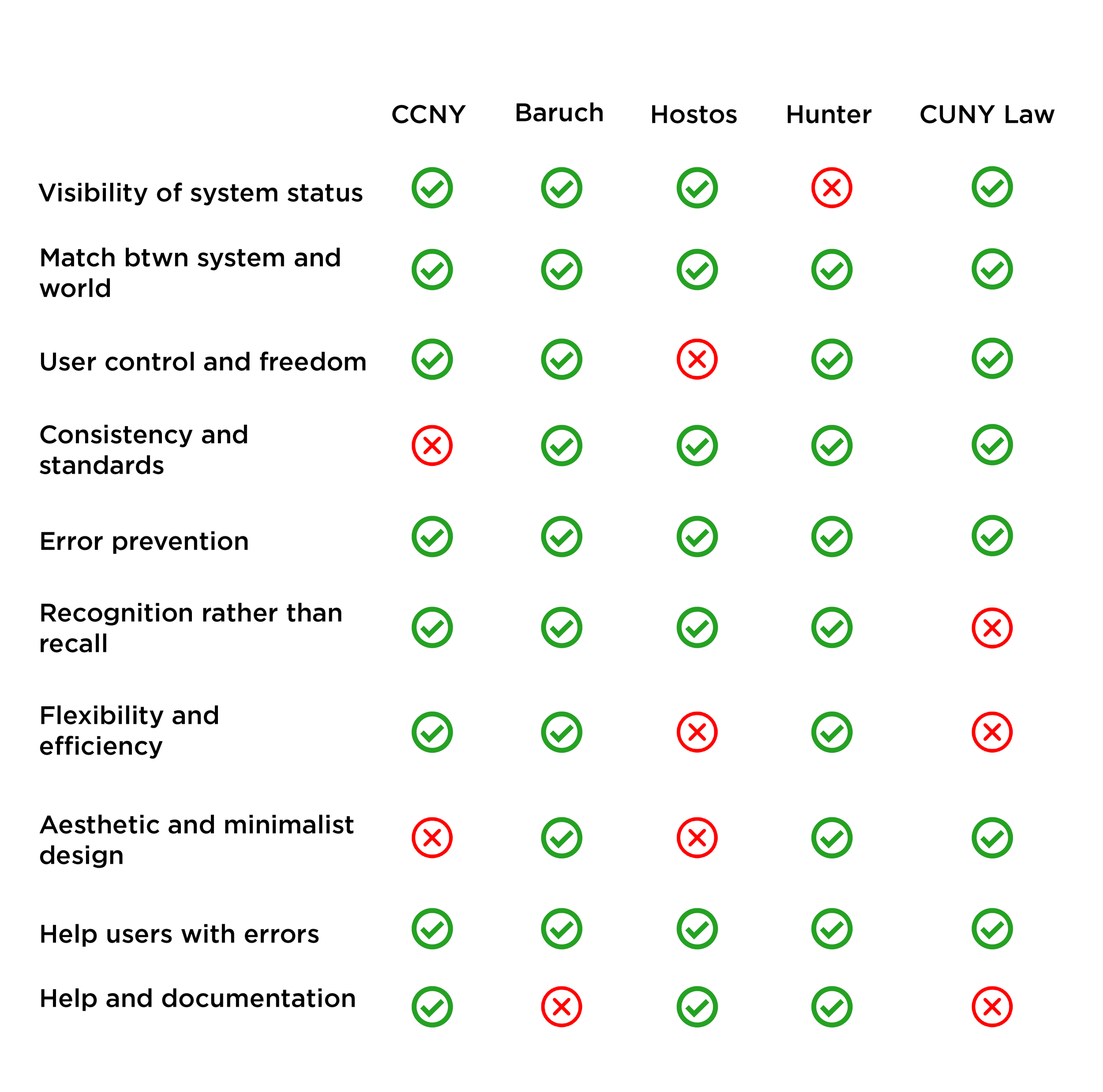
Competitive Analysis
I did a competitive analysis of other CUNY library websites. Using Nielson Norman’s “10 Usability Heuristics for User Interface Design”, I researched the strengths and weaknesses of each library and how they would benefit Queens College Library’s website.
How Might We?
How might we improve the layout of the website to lessen user confusion?
How might we fix broken or repeated links to prevent future errors on the website?
How might we make information consistent throughout the website so that it caters to both new and old users?
User Flow

Lo-Fi Wireframes


Conclusion
While this internship was only a month long, I was able to learn the importance of UX Research. Instead of jumping straight into ideating and designing, I had to conduct interviews and use various research methods. Although I wasn’t able to create High fidelity wireframes, I was able to gain experience in UX Research.